How to Style Your Entryway and Hallways with Art
The entryway is the handshake of your home. Here's how to turn neglected hallways and foyers from empty corridors into spaces that actually feel like home.
Most people decorate their entryways for guests. That's the wrong audience.
Your guests see it once, maybe twice. You see it every single day. Twice, actually: once on the way out and once when you come home. That second moment is the one that counts. Three seconds after you turn the key, your house has either welcomed you or it hasn't.
Leaving those walls bare isn't minimalism. It's just something that never got decided.
The Entryway: Start With Size
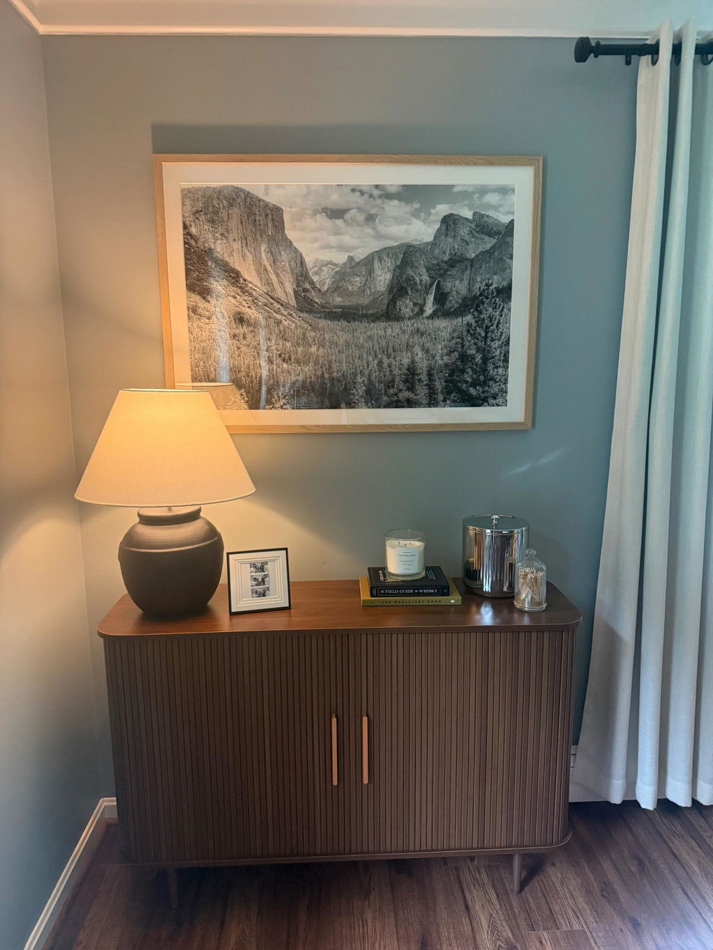
The single most common mistake is choosing art that's too small. An 8x10 over a console table doesn't look restrained. It looks like you haven't finished yet.
Here's the number that actually helps: large framed art should span roughly two-thirds of whatever furniture is beneath it. Over a standard 48-inch console, you want something at least 30 inches wide. And if you're going straight on the wall without furniture underneath, go bigger than feels comfortable. The piece that looks imposing on a product page reads perfectly normal on a real wall.
One strong print usually beats three smaller ones here. The goal isn't decoration. Its impact. Something that earns a pause.
Black and white wall art does this well in entryways. High-contrast monochrome reads clearly even when the light is dim or uneven, which describes most entryways. A dramatic landscape, a wide seascape, an architectural shot in stark relief. All of these land immediately without asking the viewer to interpret anything. You get it right away.
If you want warmth instead of drama, earthy photography fills that role. A canyon at golden hour. A misty mountain range. Our landscape photography prints work well here because they create depth. Your eye travels into the frame the same way your body is about to travel into the house. For more on why photography works differently in residential spaces than paintings do, our piece on fine art photography is worth reading.
Hung vs. Leaned: They Read Differently
Hanging art is intentional, secure, stable. The right call for most spaces.
But leaning a large frame against the wall on top of the console does something hanging doesn't quite pull off. It looks collected rather than installed. Relaxed. Like it was placed there with care and then left alone. This works when the frame has real weight to it. A thin frame leaning against a wall looks like you ran out of time. A thick, heavy frame leaning looks like a decision. Put a tall vase or sculptural object slightly in front of it, let the overlap happen, and the whole thing reads as considered rather than accidental.
Hallways Are a Different Problem Entirely
You don't sit in a hallway. You move through it. That changes what art needs to do.
Single small pieces don't hold up here. There's no reason to slow down for them. What draws the eye down a corridor is repetition. A sequence of something. Multiple pieces give you something to track as you walk through the space, which is exactly why sets outperform individual prints in hallways even when they'd feel like too much in a living room.
For shorter walls: a set of 2 wall art hung at the same height in a clean horizontal line is often the best answer. Two related prints, matching frames, even spacing. Not complicated. Which is the point. Enough rhythm to feel designed, not so much that it crowds a narrow space.
The trick with pairs is choosing images that are related but not identical. Two coastal photographs from different angles. Two mountain landscapes shot in different seasons. Similar enough that the eye reads them as a set. Different enough that there's something to notice the second time you walk past.
For longer runs of wall: a gallery wall art set of four to six frames in a matching grid creates something that works like chapters. As you walk past, the images unfold. A matched set handles all the visual coordination work: the frames are already the same, the tonal range is already consistent. That's what makes a group of frames read as a single designed moment rather than a collection of separate decisions.
The one rule for any multi-piece arrangement: coherence within the collection. Framed wall art sets from the same photographic series hold together naturally because the visual language is already unified. Mixing unrelated styles in a grid doesn't read as eclectic. It reads as noise.
The Practical Rules (The Short Version)
Width in narrow corridors: Art should cover no more than 60-70% of the available wall width. In a 36-inch hallway, individual pieces shouldn't exceed about 22 inches wide. Two well-sized prints in a tight horizontal pair look far more considered than one large framed art piece that's fighting the architecture of a narrow space.
Hanging height: Center art at 57-60 inches from the floor. Above furniture, the bottom of the frame should sit 6-8 inches above whatever's beneath it. Any higher and it looks unmoored. Any lower and it crowds the surface and the whole thing looks accidental.
Frame depth: Low-profile only in narrow corridors. Deep shadow boxes protrude into walking space and get bumped. A flat 1-inch frame sits flush against the wall and stays there.
Lighting: Most entryways and hallways don't have great natural light. A single adjustable recessed fixture or a picture light mounted above the frame makes a surprising difference. Not just for the art, but for the feeling of the entire space. One detail worth getting right: warm white (2700-3000K) suits warm wood or gold frames and earthy nature prints. Cool white (4000K) works better with matte black frames and black and white photography prints. Small call, more noticeable than people expect until they actually see it side by side.
Connect It to the Rest of the House
Here's the part most decorating guides skip: entryway and hallway art shouldn't be chosen independently. It's the opening of your home's visual story. If the opening doesn't connect to what follows, the whole thing feels like different rooms from different houses rather than one coherent home.
If your living room uses black and white wall art in matte black frames, the transitional spaces need to speak the same language. Not identical. Not copied. But the same family. Use the same frame finish as a throughline even if the subjects shift between rooms. Or hold to the same photographic register throughout: coastal in one room, mountain in the hallway, everything in the same tonal range. The transition feels like a continuation rather than a reset.
When these spaces feel coherent with the rest of the home, something real happens. The whole house starts to feel designed rather than assembled. Our guide to styling your living room walls goes deeper on this, and so does our piece on designing a home that breathes. The short version: your entryway is where the story starts. It's worth telling it well.
The Spaces You Walk Through Every Day Deserve Some Attention
Your entryway and hallways aren't afterthoughts. They're the rooms you encounter more than any other part of your home. The art you place there shapes something small and constant about how your home feels to live in. Not for guests. For you.
One piece of large framed art at the door. A set or grid down the hallway. Lighting that actually lets the photography do its job. A frame finish that ties these spaces to what comes next. None of it is complicated. It just means making a few actual decisions instead of leaving the walls for last.
If you're not sure where to start, browse our curated wall art sets and filter by number of pieces. Everything is designed to work together, which takes a lot of the guesswork out of the arrangement.
FAQ
What size art should I put in my entryway?
The art should span roughly two-thirds of the width of any furniture beneath it. Over a standard 48-inch console table, aim for a piece between 30 and 36 inches wide. Hanging directly on the wall without furniture below? A 24x36 inch piece or larger gives the visual weight the space needs. Anything smaller than 16x20 as a standalone will look like a placeholder regardless of how good the image is.
What art looks good in a narrow hallway?
Photography works particularly well because it creates spatial depth, which makes corridors feel wider than they are. Landscapes and seascapes pull the eye into the frame rather than stopping at the wall. For narrow spaces, a set of 2 wall art pieces at the same height in a horizontal line keeps the visual momentum moving without cluttering the space. Keep frames low-profile so they don't protrude into walking space.
Should hallway art match the rest of the house?
Not exactly, but it should share a visual language with adjacent rooms. The easiest throughline is frame finish: matte black, natural wood, or brushed brass used consistently throughout the home creates coherence without requiring identical prints. Subject matter can shift between rooms, but the tonal register and style should feel related. A home built around cool-toned black and white photography will feel disjointed if the hallway breaks into warm abstract prints in a completely different frame.
How do you hang a gallery wall in a hallway?
Map out the arrangement on the floor first before touching the wall. For a symmetrical grid, use a matched set of frames and keep 2-3 inches of spacing between each frame consistently. Center the full grouping on the wall both horizontally and vertically, then hang the top row first at your target height and work downward. Paper templates taped to the wall let you adjust without committing to any holes. A laser level makes horizontal alignment fast and accurate.