City Photography Prints: Which Urban Subjects Actually Work on a Wall
City photography prints work best in homes far from the city they show. That sounds backwards until you think about the window.
A photograph of the Golden Gate Bridge in a San Francisco apartment that looks out on the bay competes with the view. The real thing is right there, at higher resolution, through the glass. The print becomes redundant, or worse, a slightly diminished version of something the room already has. The same photograph in a farmhouse in Vermont or an apartment in Denver does what art is supposed to do. It brings in something the room does not otherwise contain.
That is the opposite of how city prints usually get sold, which is as hometown pride: the skyline print for the person who lives under that skyline. It sells the category short.
What a City Brings to a Room That a Landscape Cannot
Urban photography brings two things a landscape cannot: lines someone drew on purpose, and human scale.
A bridge, a facade, a canal, or a crosswalk is built from straight lines that repeat at right angles. Hang a strong structural photograph in a room with clean lines and the room's own architecture reads more clearly, because the picture and the space speak the same language. That is why city work does so well with exposed brick, steel window frames, and open floor plans.
Human scale is the second thing. A mountain photograph tells you the world is large. A photograph of a Paris street in the fall, with people moving through it, tells you the world is large and full of people. Some rooms need that.
Nearly all of Inframe's city prints come from two photographers whose main subject is not cities at all. Ran Milo, Inframe's founder, has spent more than 30 years photographing landscapes across the American West and beyond. Yiftah Shahar has documented hundreds of national, state, and regional parks. They approach a skyline the way they would approach a ridgeline, starting with the foreground, and you can see that habit in the skylines below.
The Three City Subjects, Ranked by How Well They Hold Up
Landmarks first, skylines second, street scenes third. That order holds for almost any wall you look at daily, and it has less to do with how good each photograph is than with how long each kind of subject stays interesting.
Landmarks and structures are the strongest. A bridge, a tower, a single piece of architecture isolated in the frame. These work because they are compositions before they are places. The Golden Gate Bridge print is shot in black and white using HDR, and its arches and suspension cables carry the whole picture. The Brooklyn Bridge print sets the same kind of structure against Manhattan's lights on the water. The Bean in Chicago goes furthest toward pure form: a black and white study of a mirrored surface with the skyline bent across it.
Skylines sit in the middle. A skyline is a horizon line made of buildings, and it behaves in a room much the way a mountain range does. The risk is that most skylines are shot from the same postcard viewpoint in flat light. What separates a good one is a foreground and a vantage point. New York Tides looks at the Manhattan skyline from the edge of the East River in low morning light, with weathered wooden pilings rising from the water in front of the towers. Without the pilings, it would be a postcard. Skyline Triptych takes a different route: it is a single photograph of San Francisco shot through the three arched windows of Coit Tower, so the building itself divides the city into three panels inside one frame.
Skylines need width. The largest single print is 40x30 inches, which comfortably covers a wall above furniture up to about 60 inches wide. Past that, a set of three does the job better, and the city sets run up to 90 inches across combined. The sizing and hanging guide walks through the measuring.
Street-level scenes are the hardest to get right and the most likely to wear thin. A street scene with people in it is a narrative image. It is engaging the first time and tiring by the two-hundredth, because the eye keeps rereading the story. That makes it a question of placement: street scenes suit rooms you pass through. The ones that hold up on a main wall are carried by structure. Dumbo NYC is a Brooklyn street, but what you see is symmetry: brick buildings on both sides, cobblestones pulling the eye forward, the Manhattan Bridge closing the view. Welcome to Tokyo is shot from above Shibuya Crossing, so the crowd below turns into a pattern.
Why Black and White Usually Wins for City Prints
Black and white city prints win because they strip out the visual noise that color brings to a street.
Cities are loud in color. Signs, cars, awnings, reflections, and light from a dozen sources at a dozen color temperatures. Most of that is incidental. It is simply what happened to be there when the shutter opened. Remove it, and what is left is the geometry of the buildings, the direction of the light, and the pattern of the windows. Bay Breeze and Bay Breeze B&W are the same photograph, sailboats on the bay with the Golden Gate behind them, printed in color and in black and white. Hang them side by side and they read as two different pictures.
Try to describe what a photograph is about without naming a color. If you can, black and white will hold it. If you cannot, the color is the subject.
London Christmas is Oxford Street at night in December: white lights strung across the street, black cabs, and red double-decker buses carrying most of the color. In its black and white counterpart, the buses lose their red and fold into the traffic, and the picture becomes about the lights and the buildings. Seattle Reflections is the Space Needle mirrored in the iridescent pink and blue skin of the Museum of Pop Culture. Take the color out of that one and there is nothing left to look at.
As a default, though, black and white is the stronger choice for city prints. The black and white collection has city subjects alongside natural ones.
A Photograph of Paris, Not a Photograph of You in Paris
A fine art print of a city holds the place without putting you in the picture, which is why it lasts on a wall longer than a travel photo.
Most people's instinct for remembering a place they love is a personal photo. You, on the bridge, squinting into the sun. Those pictures are about the person, not the place, and a room can only carry so many of them before it starts to feel like a scrapbook.
Venice Canal is shot from the water at the mouth of the Grand Canal, with the dome of Santa Maria della Salute and the bell tower of St. Mark's rising over a row of old terracotta buildings under a sky full of clouds. If you have stood there, it gives that back to you every time you walk past it. If you have not, it still works as a photograph. The memory sits underneath the image instead of on top of it, and that is the difference between a souvenir and a piece of art. It is also why Ponte Vecchio, Timeless Prague, and Timeless Kyoto work in homes thousands of miles from those cities.
The same logic works inside the country. A Chicago skyline in a Phoenix living room, a Brooklyn street in an Austin home office, a Golden Gate print in a house in Ohio. The farther the print is from the city, the more it gives the room.
City Sets of Three
A city set gives one place three frames, so you see the city from three angles. The New York Set, Chicago Set, Los Angeles Set, San Francisco Set, and Paris Set are all black and white, which keeps three images of one city from turning busy on a single wall. The Chicago Set places a single figure in each of three landmark locations, and the Los Angeles Set combines the Hollywood Sign, Griffith Observatory, and the Beverly Hills sign.
Where City Photography Prints Belong in a Home
A home office is where a city print makes its best case, with one caveat. If what you want from the wall is somewhere to rest your eyes between screens, a landscape does that job better, and the nature photography guide explains why. If what you want is for the room to feel less empty, a city photograph is full of other people at work, and in a room where you work alone, that reads as company.
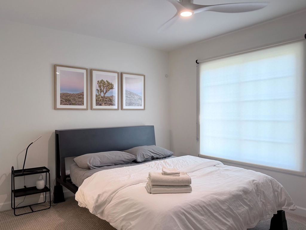
Bedrooms are the hardest fit, for the opposite reason. Most city photography carries too much implied activity for a room whose whole purpose is winding down. The exception is a subject fogged or minimal enough to have lost its activity: a bridge disappearing into weather, a single facade in flat light.
Hallways and entryways are where street scenes earn their place.
Mixing city and nature prints on one wall? Connect them through light. A city at dawn and a mountain range at dawn share the same low angle and long shadows, and that shared hour holds a wall together better than matching subjects.
Three Questions Before You Buy a City Print
1. Will you sit facing it, or walk past it? If you will sit facing it, choose a landmark or a skyline. If you will walk past it, a street scene is a good choice.
2. Can you describe it without naming a color? If yes, black and white will hold it and will be easier to place. If not, buy it in color, because the color is the picture.
3. Do you have history with the city? If you lived there once or keep going back, a set of three builds the fuller impression. If you simply love the image, a single strong landmark is the safer buy.
For the frame and mat, the guide to framed, matted, and print-only options covers every choice you will see at checkout.
Browse the urban photography collection for the full range of American, European, and Asian cities.
FAQ
Who took Inframe's city photography prints?
Nearly all of them come from two landscape photographers. Ran Milo, Inframe's founder, has more than 30 years of landscape work from the American West and around the world. Yiftah Shahar has documented hundreds of national, state, and regional parks. Both bring a landscape photographer's eye to cities, which is why so many of the skylines are built around a strong foreground.
Should city photography prints be black and white or color?
Black and white as a default. Cities are visually noisy in color, and removing it leaves the geometry and light the photographer was actually after. The exception is when color is the subject, such as red buses under Christmas lights or a reflection in a colored facade. A quick test: if you can describe the picture without naming a color, black and white will hold it.
Which American cities are available as fine art prints?
Inframe's urban collection includes New York, Chicago, Los Angeles, San Francisco, and Seattle, among others, alongside European and Asian cities such as Paris, London, Venice, Florence, Prague, Tokyo, and Kyoto.
What size city print do I need?
Single city prints run from 10x8 inches up to 40x30 inches, depending on the image. The largest covers a wall above furniture up to about 60 inches wide. Past that, a set of three is the better fit. Inframe's wall art sizing guide shows how to measure.
Which cities come as sets of three, and how big are they?
New York, Chicago, Los Angeles, San Francisco, and Paris, all in black and white. The New York, Chicago, Los Angeles, and Paris sets go up to three 30x40 inch prints, 90x40 inches combined. The San Francisco Set tops out at three 28x40 inch prints, 84x40 inches combined.
What frame and mat should I choose for a city print?
Every city print comes in white, natural, or black, and every one can be ordered with or without a mat. Black is the usual starting point for city work because of its hard lines. Inframe's framing guide explains how to choose for a specific photograph.