Framed, Matted, or Print Only: What You Are Actually Choosing at Checkout
Seven or eight options in a dropdown, depending on the image. Print Only in one or two paper finishes, then three frame colors, each available with or without a mat. Most people scroll that list, recognize none of the differences as meaningful, and pick whatever is first or cheapest.
Two of those choices change the piece substantially. The rest are variations on taste. Knowing which is which takes about four minutes, and it is worth having before you order, because every piece here is made to your specification after you buy. There is no warehouse version to swap it for.
Framed or Print Only
A framed piece arrives strung and ready to hang. Print only arrives as the paper alone, printed edge to edge, for you to frame locally. Both options appear on every print in the fine art photography collection.
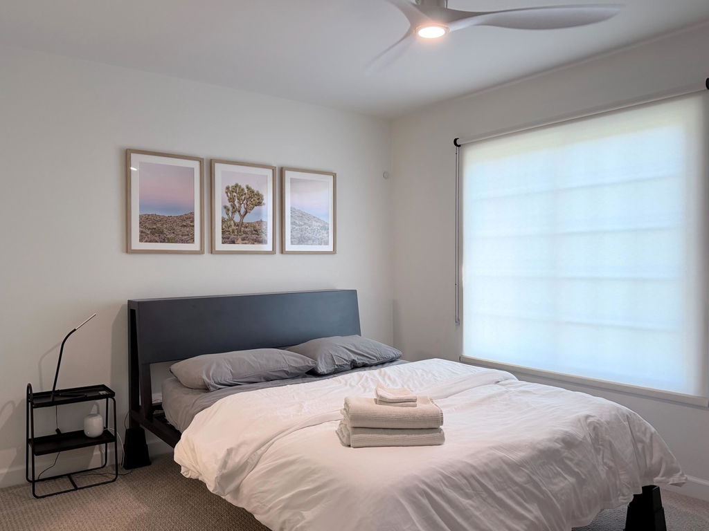
Framed suits most buyers, and not only for convenience. The frames are made from sustainably sourced hardwood by Guild-certified framers, and the glazing, mat, and mounting have already been matched to the image. That is not the same thing as a mass-produced frame bought separately and filled at home.
Print only earns its place in three situations. You have an existing frame to fill. You have a specific material palette in the room and want a local framer to match it exactly. Or you are buying several pieces for one wall in a frame style that is not offered as standard.
Two practical notes if you go that way. Unframed prints larger than 14x11 inches ship rolled in a protective tube, so unroll yours soon after it arrives and let it flatten under even weight between clean board. Fine art paper takes a memory from the tube, and after a few weeks flattening it cleanly becomes a job. Smaller prints ship flat and avoid this entirely.
The second note is the paper finish, which only appears on print-only orders. Matte is the safer default and suits most photography, particularly soft light and wide tonal range. Lustre adds a slight sheen that lifts contrast, which suits high-key subjects and moving water. A handful of images offer Semi Gloss as a third option. The comparison of photography prints and canvas goes into paper surfaces properly if that is the decision you are weighing.
Mat or No Mat
Add a mat for images with a defined subject, and skip it for panoramas and for photographs whose edges carry detail. That is the short version of a choice that changes the piece more than the frame color does.
A mat is the border of card between the print and the glazing. Its job is optical. It gives the eye a place to arrive before it reaches the image, which is why a matted photograph reads as presented rather than merely hung. It also holds the print surface off the glazing, which matters over years.
The mat here is snow white and 100% acid-free. That second part is not marketing. Standard card contains lignin, which yellows with age and can carry acidity into the edge of the print. The conservation board does not. On something you intend to keep, it is the difference between a clean white border in fifteen years and a browning one.
Width is set by the frame size rather than chosen: 1 inch up to 10x10, 1.5 inches up to 11x14, and 2 inches at 12x16 and above. The border scales with the piece, which is why matted prints look proportionally consistent across sizes.
Choose a mat for images with a defined subject and a composition that resolves inward. A single peak, like Black & White Summit, where the mountain sits clear of its own edges. A bridge. A forest interior with a light source at its centre. The border gives these separation and formality.
Choose no mat when you want the image to fill the frame and read as a contemporary object. Panoramas benefit from this, because a border can make an already wide image feel narrow. So do images that fade outward rather than resolving inward: Pacific Flight is birds over a misty ocean where the horizon dissolves into the sky, and a hard white border would fight that. Detail running right to the frame edge is the other case, since minimal cropping can occur to fit an image to the mat opening. If the edges of the photograph are doing work, skip the mat. The horizontal wall art collection is where most of the panoramic work sits.
One consequence to plan for: a mat reduces the visible image. A 16x20 inch piece with a 2 inch mat shows 12x16 inches of photograph. Same wall footprint, smaller picture. The sizing and hanging guide covers how to work back from your wall, and the print and frame sizing chart lists the visible and external dimensions for every size.
Which Frame Color
Three standard options on paper prints: white, natural, and black. The canvas pieces carry a wider range including dark brown and metallic finishes, and other colors and materials are available if you message before ordering.
The principle worth taking away is one line: match the frame to the photograph, not to the room.
Almost everyone does the opposite. They look at the oak floor and the walnut sideboard and choose natural, and then a hard monochrome cityscape arrives inside a warm timber border and something is subtly wrong that they cannot name. The frame is agreeing with the furniture and arguing with the picture.
Here is the test. Look at the photograph and ask whether its edges are hard or soft.
Yosemite Shadows is hard. Half Dome and El Capitan at sunset, granite cut by shadow, every line in the picture decisive. It wants a frame that agrees: black, thin, no softening.
Foggy Treetops are soft. Mist through pines, trunks blurred at their outlines, nothing in the frame with a firm edge. Put that in black and the frame becomes the hardest element in the piece, which is exactly backwards. Natural timber lets it stay soft.
Same collection, same photographer standards, opposite frame answer. The subject does not decide this. The edges do.
White sits between them and is genuinely useful in light rooms with high-key images, where black would be too much punctuation. It is the one to think twice about on a white wall with a pale photograph, where the whole piece can lose its edges. Not wrong, but check it against the wall before committing.
One legitimate exception. If you are building a wall or a whole house where several pieces need to read as a set, a single consistent frame finish across all of them will do more for the room than optimizing each piece individually. In that case choose the finish that suits the majority of the images and accept the compromise on the rest.
The black and white collection is the easiest place to test your eye on this, because monochrome images make the frame relationship visible immediately.
What You Are Actually Buying
There is no glass on any framed paper print. The glazing is shatterproof acrylic Perspex, which gives UV protection and minimal glare. That is a better answer than glass in a home: it weighs substantially less at large sizes where a glass-fronted piece becomes genuinely awkward to hang safely, it cannot shatter, and it survives shipping. Canvas pieces are unglazed by design, which is the nature of stretched canvas rather than an omission.
Acrylic scratches more easily than glass and attracts dust through static. Clean it with a soft dry microfibre cloth. Not glass cleaner, nothing with ammonia, and not paper towel, which is abrasive enough to leave fine scratching over time.
The prints themselves are Giclée on archival fine art paper. Inframe states that colors will remain stunning for over a century under normal conditions, which is consistent with what archival pigment inks are engineered to do.
And the part that makes all of this worth reading before you order rather than after: every piece is commissioned at purchase and made to your chosen size and framing. There is a twelve hour window to cancel or modify, after which it goes into production, and returns for a change of mind are not accepted. Nothing is sitting in a warehouse waiting to be sold to someone else. Against that, every order is fully insured from production through delivery, and anything arriving damaged or imperfect is replaced at no cost. Full terms are on the shipping and returns page.
Framed with a mat, in black for hard images and natural for soft ones, covers most photography in most homes. Go without the mat for panoramas and for images whose edges matter. Go print only if you have a framer and a reason. Then check the size against your wall rather than against the thumbnail.
Browse the nature photography collection to test the hard-edge and soft-edge distinction across subjects, or the wall art sets collection if you are working with a wide wall and want the framing handled consistently across panels.
FAQ
Should I choose framed or print only?
Framed for most buyers. The piece arrives strung and ready to hang, with hardwood frames from Guild-certified framers and the glazing and mat already matched to the image. Print only makes sense when you have an existing frame to fill, want a local framer to match a specific material palette, or need a frame style that is not offered as standard.
Should I add a mat or not?
Add a mat for images with a defined subject and a composition that resolves inward. The white border gives separation and formality. Skip it for panoramas, where a border makes a wide image feel narrow, and for images with important detail at the edges, since minimal cropping can occur to fit the image to the mat opening.
Does the mat make the picture smaller?
Yes. The size you select is the glaze dimension, and the mat reduces the visible image by its width on each side. A 2 inch mat on a 20x30 inch selection leaves 16x26 inches of photograph. Mat width is set by frame size: 1 inch up to 10x10, 1.5 inches up to 11x14, 2 inches at 12x16 and above. The frame adds a further 0.7 inches per side to the external dimension.
What frame color should I choose?
Match the frame to the photograph rather than the room. Hard-edged, high-contrast, and architectural images take black. Soft, atmospheric images with no hard line take natural timber. White suits light rooms with high-key images, though on a white wall with a pale photograph the piece can lose its edges. Paper prints offer white, natural, and black as standard; other colors and materials are available on request.
Is the glazing glass or acrylic?
Shatterproof acrylic Perspex on framed paper prints, which provides UV protection and minimal glare. It is lighter than glass at large sizes, cannot shatter, and survives shipping. Canvas pieces are unglazed by design. Clean acrylic with a soft dry microfibre cloth only, avoiding glass cleaner, ammonia, and paper towel.
Can I change my order or return it?
There is a twelve hour window to cancel or modify by email. Every piece is commissioned at purchase and made to your chosen size and framing, so after that window it is in production, and returns for a change of mind are not accepted. Orders are fully insured from production through delivery, and anything arriving damaged or imperfect is replaced or exchanged at no cost.ש
How does it arrive and how long does it take?
Allow two to five business days for production and ten to fourteen business days for most deliveries, depending on location and shipping method. Framed prints and canvases travel in rigid double-wall corrugated boxes. Unframed prints larger than 14x11 inches ship rolled in a protective tube. Framed pieces arrive strung and ready to hang.